Max Gadney is a well knwon name in infographics. You would have met him if you use to attend to Malofiej, or you may have seen his name related to infographics and BBC. As he is one of those in the know, I just let him talk and introduce his favourites.
"I think this is excellent - This graphic by David McCandless uses a well-known device - the Venn Diagram - to show similarities and differences in spending cuts proposals from different UK political parties. These are often presented in tables, wheer the similarities and differences are less obvious."
"The second is not one piece of work but is a blog - Junk Charts.
Junk Charts brings a level of critique to the field of information visualisation that is lacking in most of the blogs around. Where most people seem happy to just throw up the latest piece of data art and call it 'awesome', Junk Charts always asks about the purpose of such work. "
"The third best visualisation is Schooloscope by BERG. The important thing here is in the creation of written prose from basic numerical data. Instead of taking the basic government numerical ratings, they have converted these into grammar that tells us if the school is any good."
... and now, three picks of his own...
"Done by BERG , for me at the BBC, where I was the commissioning editor on the project. It is a fantastic piece of work, so, well done you guys. Dimensions allows you to see current or historical events overlaid onto where you live."More here.
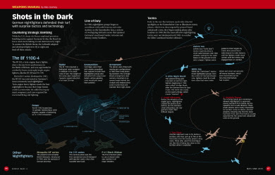
"The best 2 WWII Magazine (my weekend hobby) graphics this year were the Nightfighter (one of the first planned , when I started this project 3 years ago) and the Aircraft Carrier - (lots of data research went into this one)."
And if you like what he likes, take a look to his picks as the best of 2008.


No comments:
Post a Comment